Navigating the Patient Dashboard
Learn how to navigate your Patient Dashboard Page
The Patient Dashboard allows you to go through and look for patients with specific types of opportunities. In the top right-hand corner of the page you can filter the Patient Dashboard by location. Simply click on the office dropdown to choose which locations you would like to see.
Clicking on the date ranges at the top of the page will filter the entire Patient Dashboard by those dates.

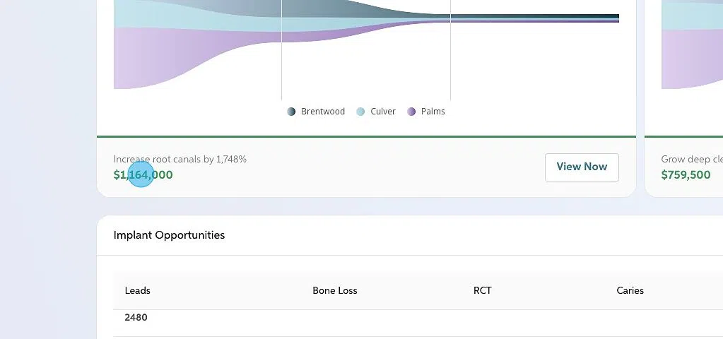
The six opportunity funnels displayed on the Patient Dashboard are Endodontic Therapy, Scaling, Implant Opportunities, Restorative Treatment, Restorative Replacements, and Impaction Opportunities.
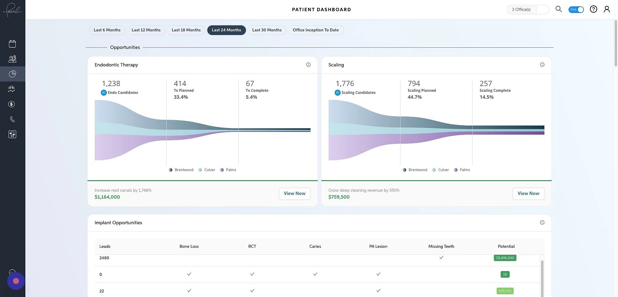
Each funnel is broken into three sections consisting of number of candidates, number and percentage of candidates treatment planned, and number and percentage of candidates who have completed the treatment.
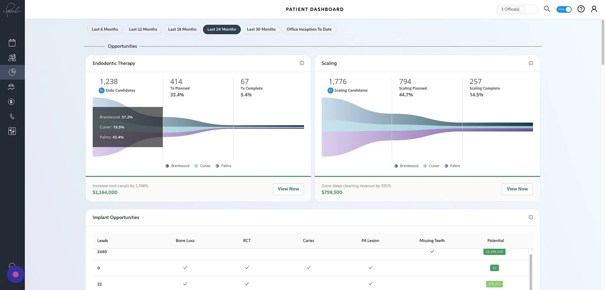
Clicking into the dollar amount or the View Now button at the bottom of each funnel will open up the candidates with that specific opportunity type in the patient details page.
The Planning Performance graph shows treatment planned as a percentage of the total opportunity.
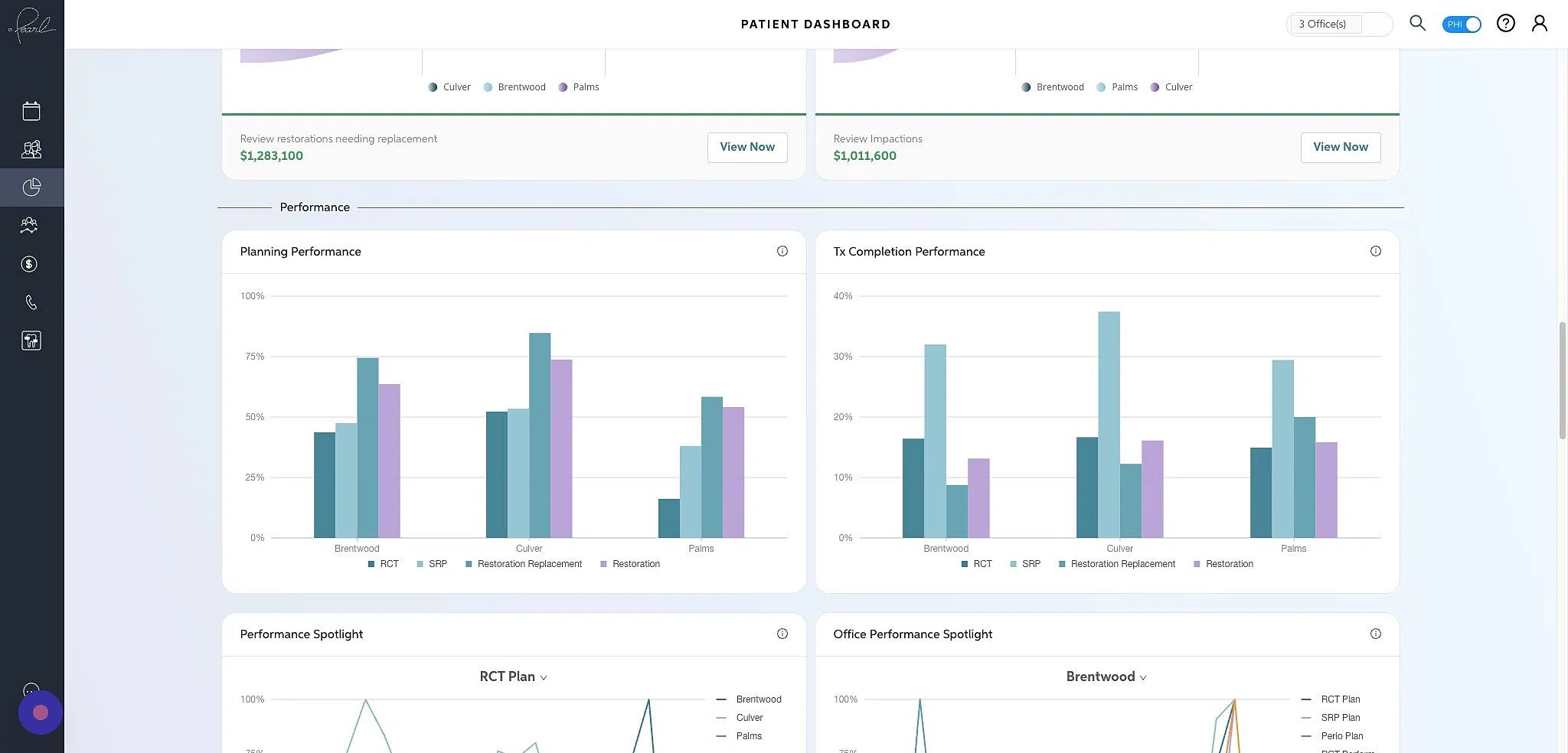
The Tx Completion Performance graph shows treatment performed as a percentage of the total planned.

The Performance Spotlight graph allows you to see how offices compare across a single planning or completion performance metric. Hovering over the arrow in the middle of the graph will allow you to filter by the plan type.
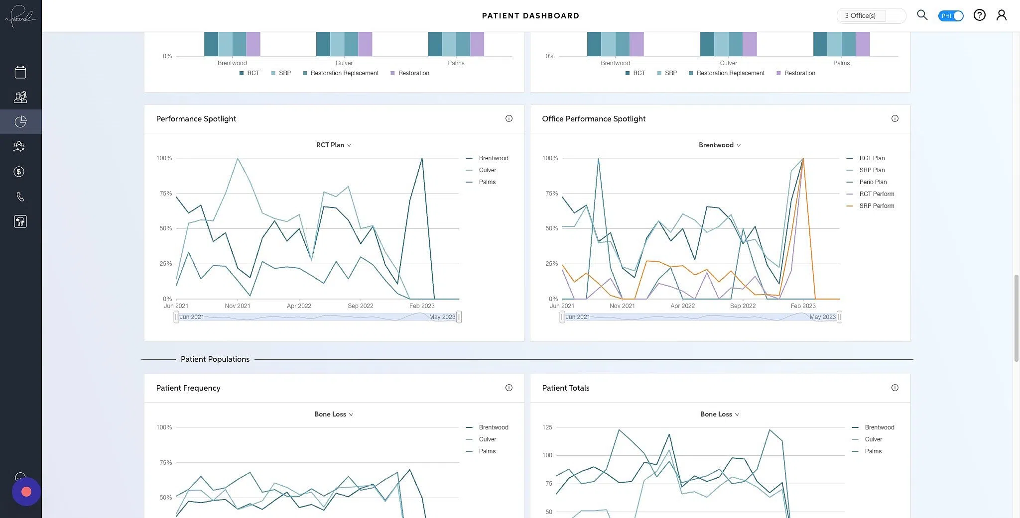
The Office Performance Spotlight graph allows you to look at all of the planning performance across a single office. Hovering over the arrow in the middle of the graph will allow you to filter by the office.
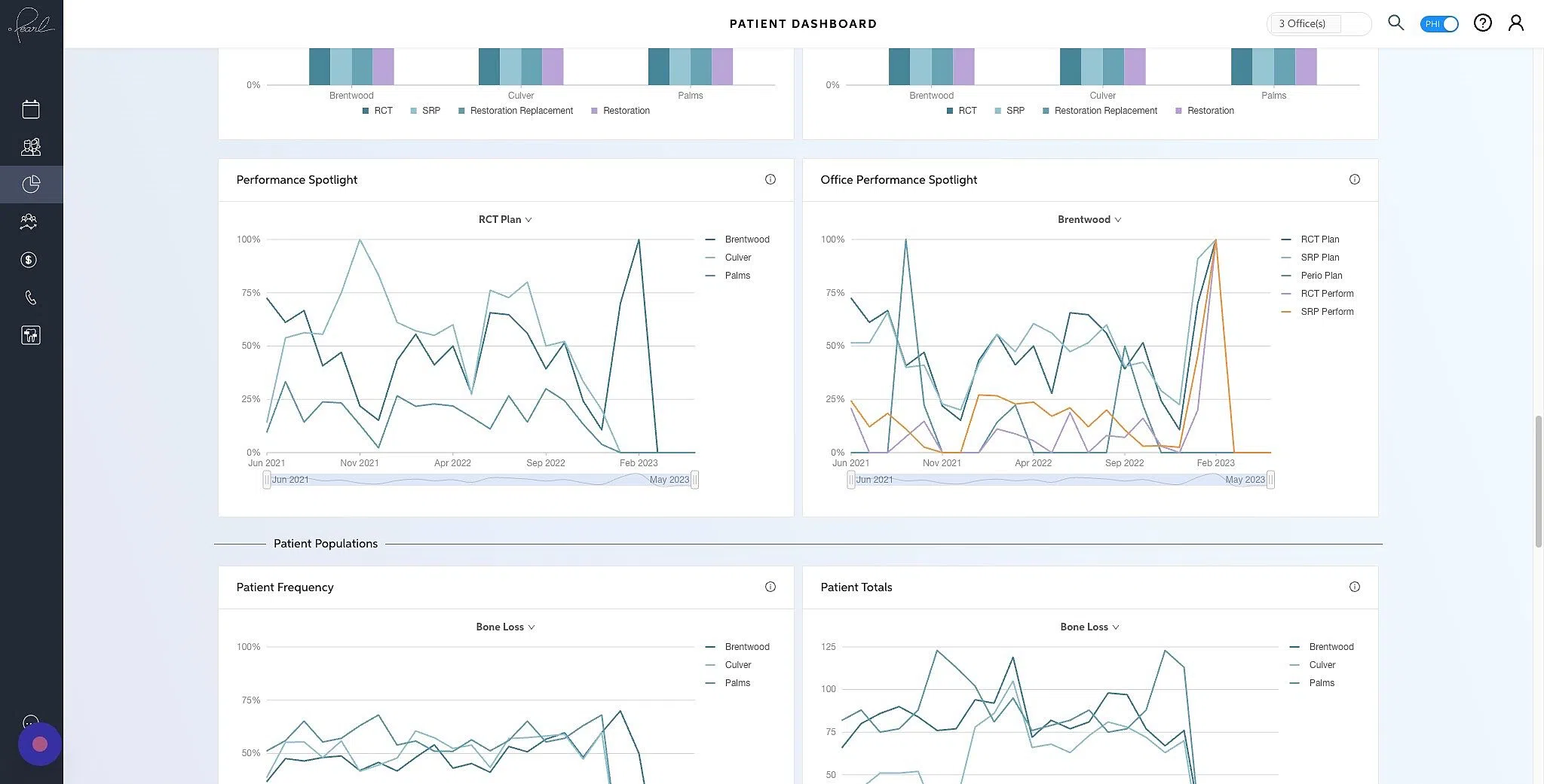
The Patient Frequency graph shows you the percentages of patients presenting with a pathology. Hovering over the arrow in the middle of the graph will allow you to filter by the pathology.
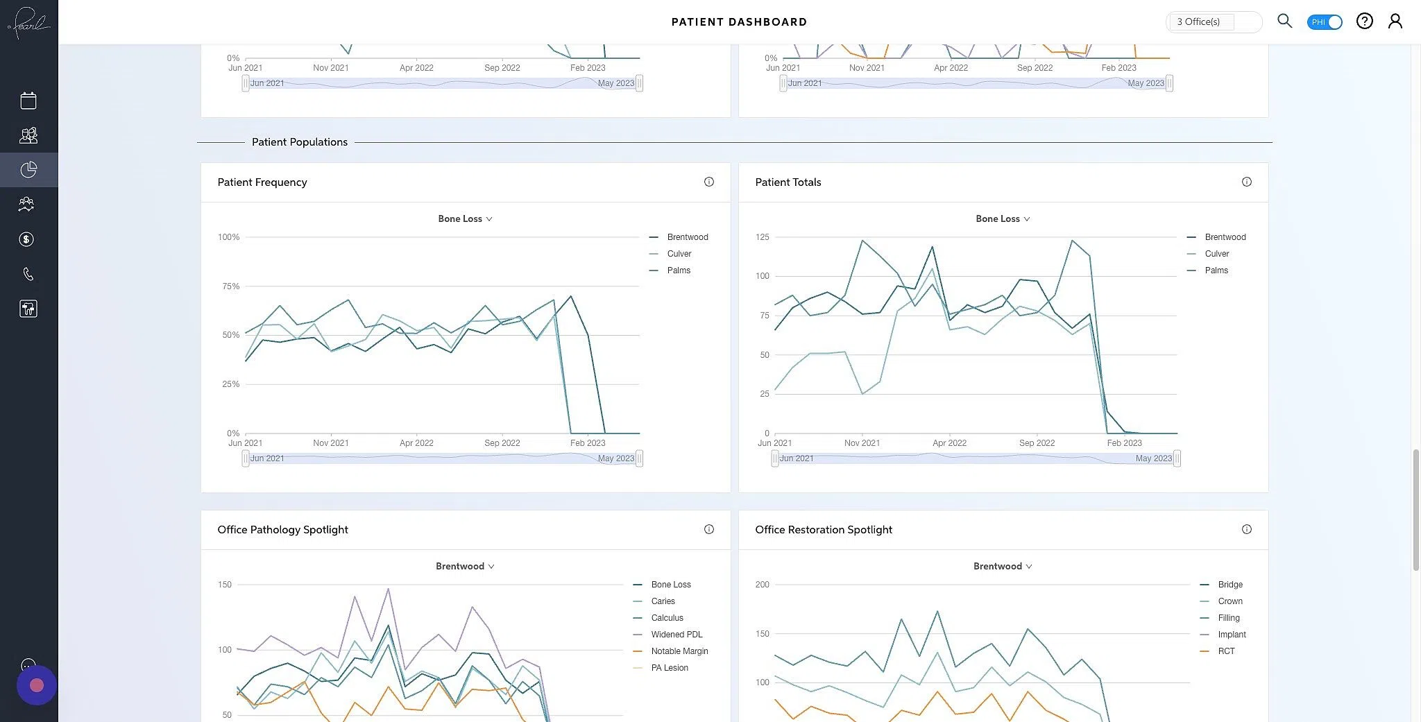
The Patient Totals graph shows you the number of patients presenting with a pathology. Hovering over the arrow in the middle of the graph will allow you to filter by the pathology or existing restoration type.

The Office Pathology Spotlight graph allows you to see the changes of patients presenting with pathologies over time. Hovering over the arrow in the middle of the graph will allow you to filter by office.

The Office Restoration Spotlight graph allows you to see the changes of patients with existing restorations over time. Hovering over the arrow in the middle of the graph will allow you to filter by office.
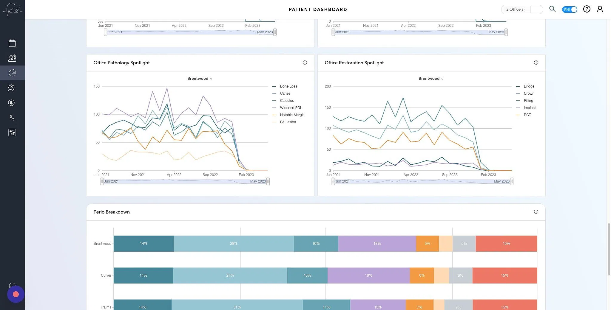
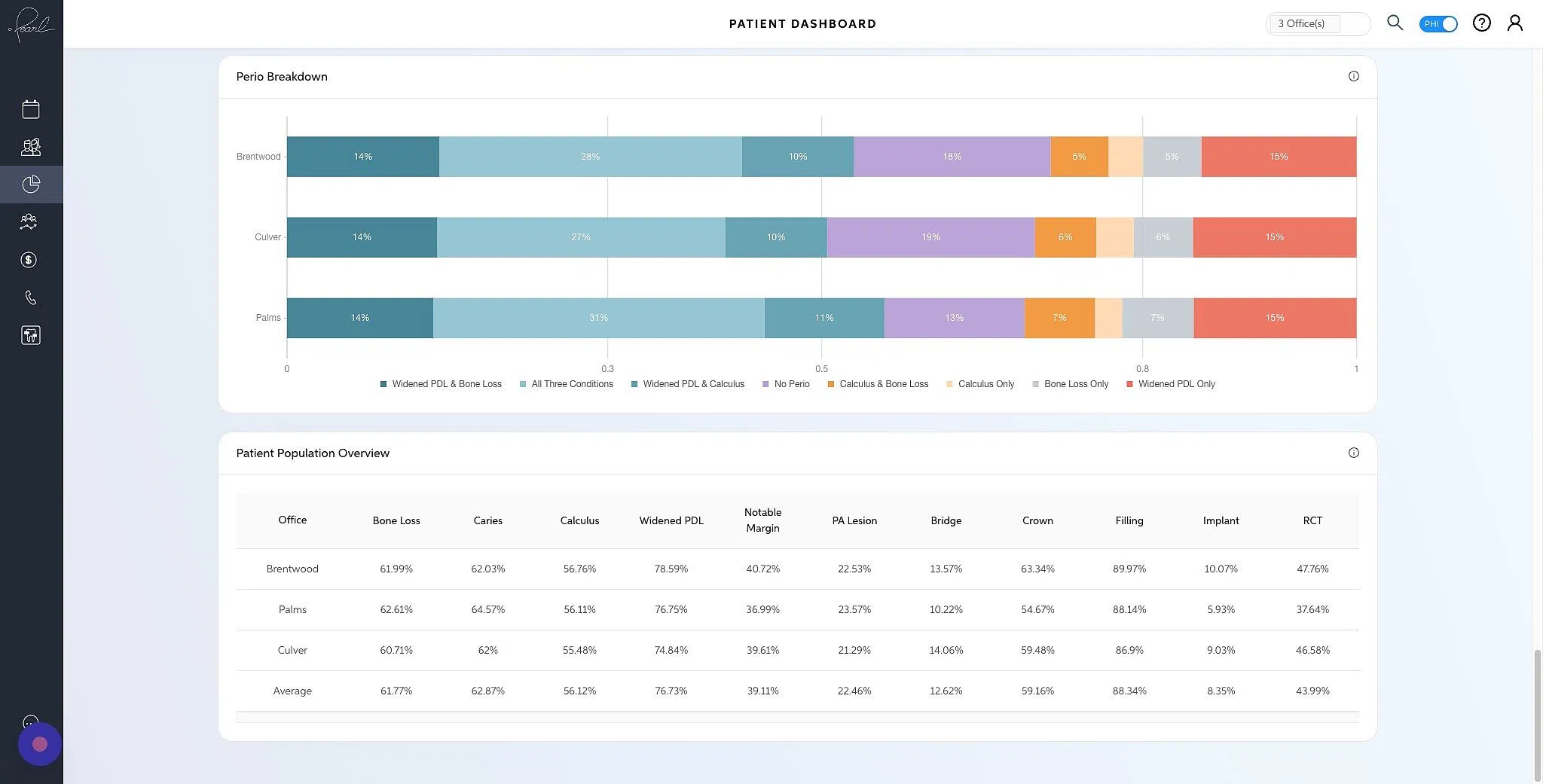
The Perio Breakdown graph allows you to see a breakdown of periodontal diseases across the patient population.
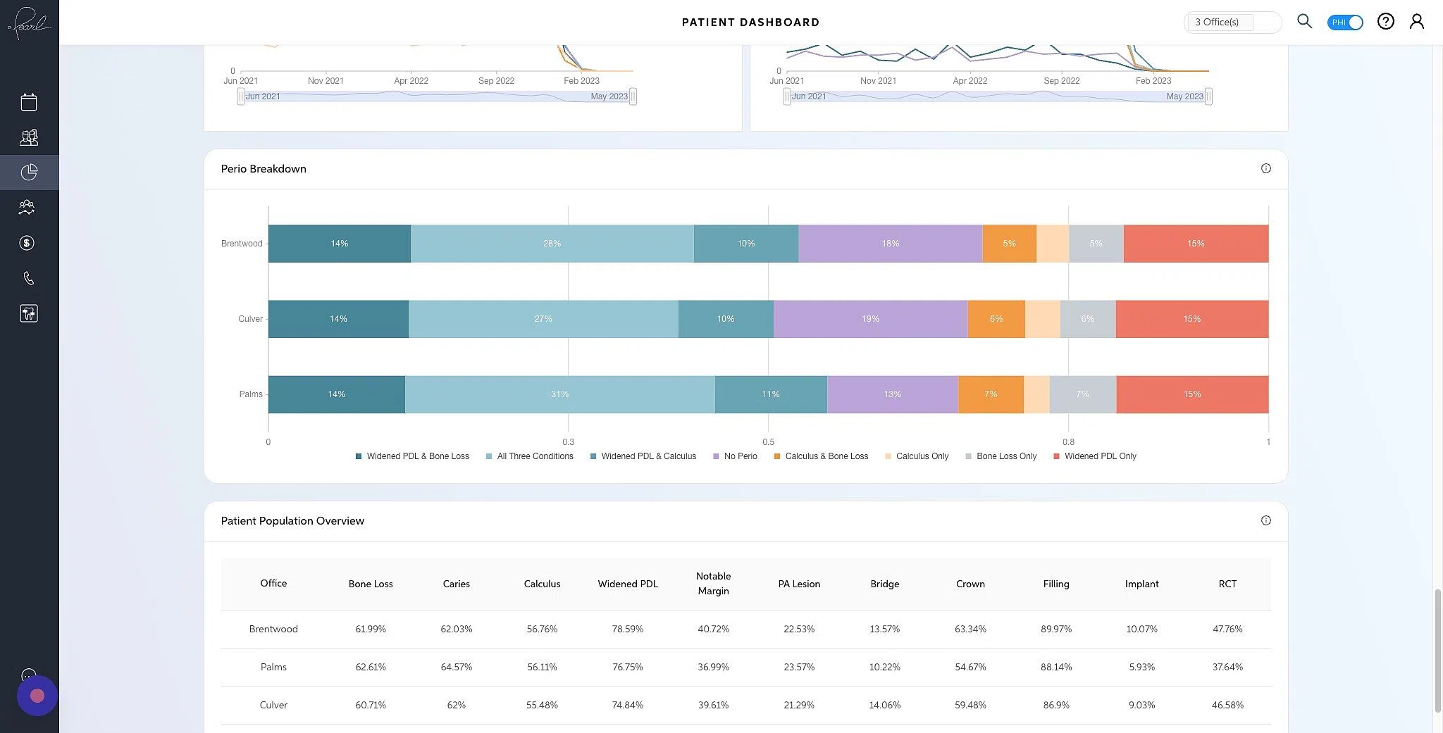
The Patient Population Overview graph allows you to see patients frequency of pathology and existing restorations across offices.